
Different Types of Visualizations in Reports
Once the report design is ready, different types of visualizations can be used which are as follows:
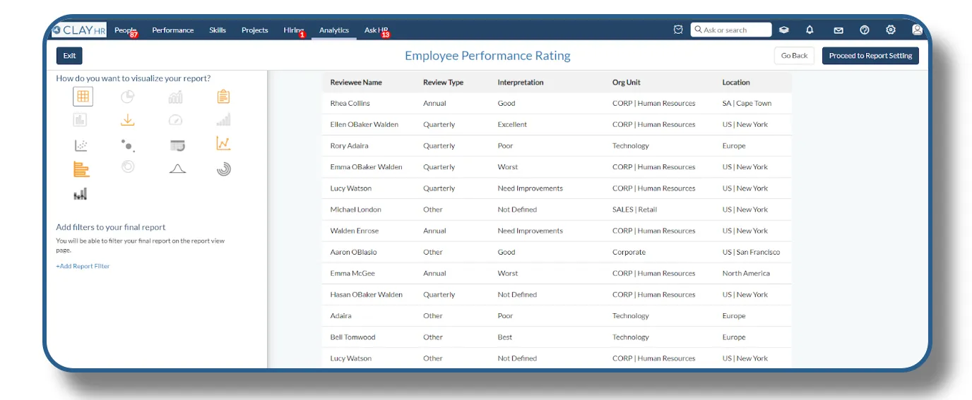
Tabular chart: Precision in Every Cell
For users who value clarity and detailed data presentation, tabular visualization is the perfect choice. It presents your data in a structured table format, making it easy to read, compare, and analyze at a granular level. It helps you to easily sort and filter data to find exactly what you need, making it a powerful visualization for detailed reporting and operational analysis.
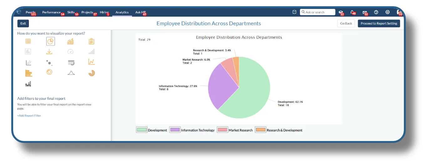
Pie chart: Simplifying Proportions
Pie Chart Visualization offers an intuitive way to understand the proportional relationships within your data. Perfect for illustrating percentages and part-to-whole comparisons, the pie chart delivers insights at a glance. Pie chart is ideal for showing how individual elements contribute to the overall total, making it perfect for financial breakdowns, market share analysis, and resource allocation.
The user needs to select one column on the basis of which pie chart is created.
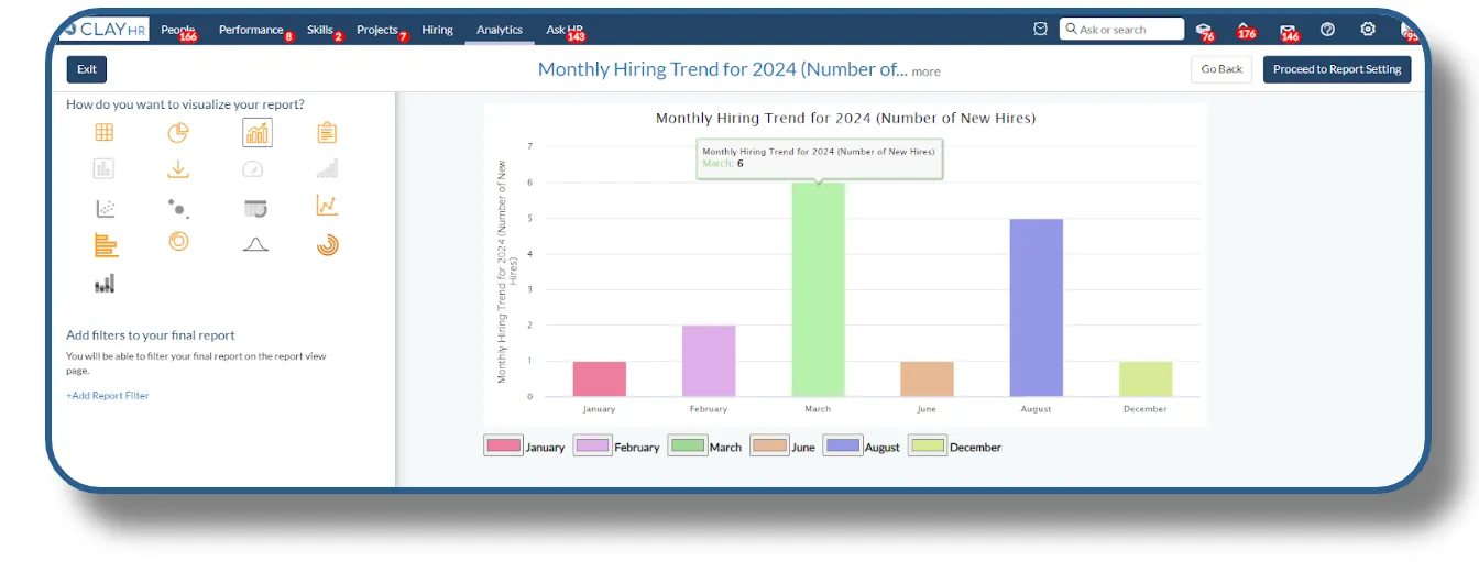
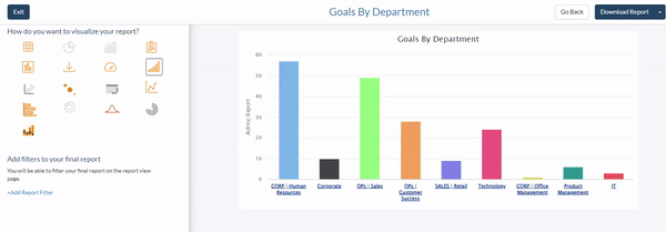
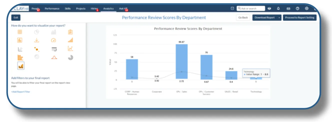
Bar chart: Comparative Clarity
Bar Chart Visualization provides a clear and straightforward way to compare data across different categories. Whether you're analyzing trends, distributions, or categorical data, the bar chart offers a visual representation that makes comparisons easy. It allows you to instantly compare the size, frequency, or magnitude of different categories, making it ideal for performance metrics, sales data, and survey results.
The user needs to select one column to create a bar chart.
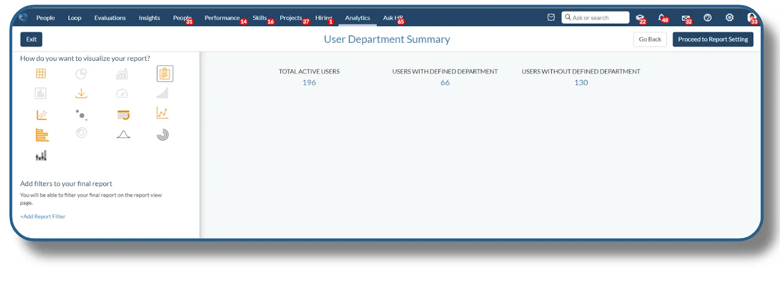
Summary Visualization
The summary visualization shows the total count for the selected column of the report. This can be used when a person needs a quick overview of the data. It’s the perfect tool for users who need an immediate understanding of the volume of data, offering a clear and concise count at a glance. It can be used in budget planning, departmental insights, and compensation analysis.
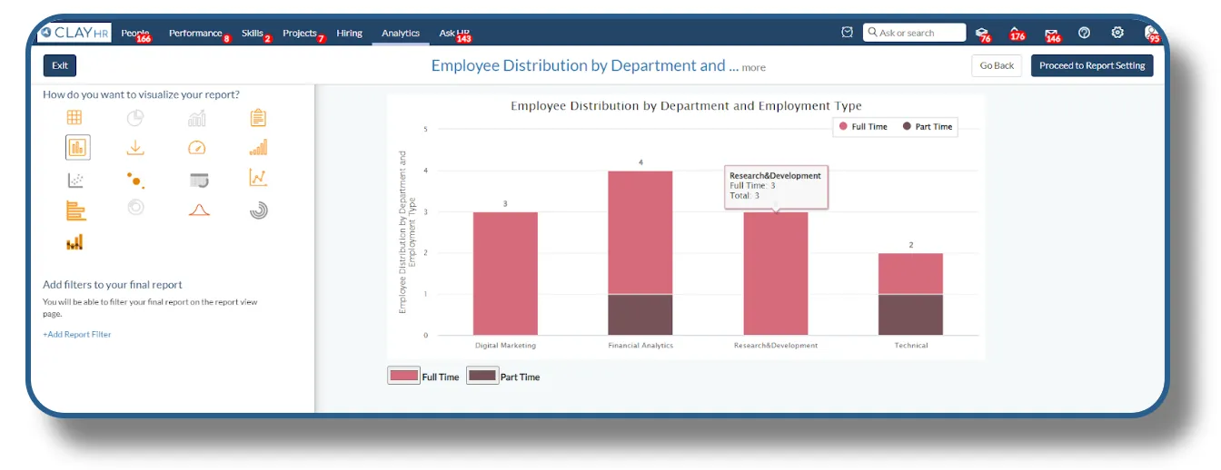
Stacked column bar: Layered Insights
Stacked Column Bar Chart Visualization is designed for users who need to analyze the contribution of different segments within a category. By stacking values within each column, this chart provides a comprehensive view of both individual and collective data, making it easier to see how each part contributes to the whole. It helps users compare both the total values and the composition of those totals across multiple categories, allowing for deeper insights into your data. This visualization can be used in departmental salary review to compare total salary expenditures across departments and see how much each job level contributes.
The user needs to choose 2 string columns to create the stacked column bar.
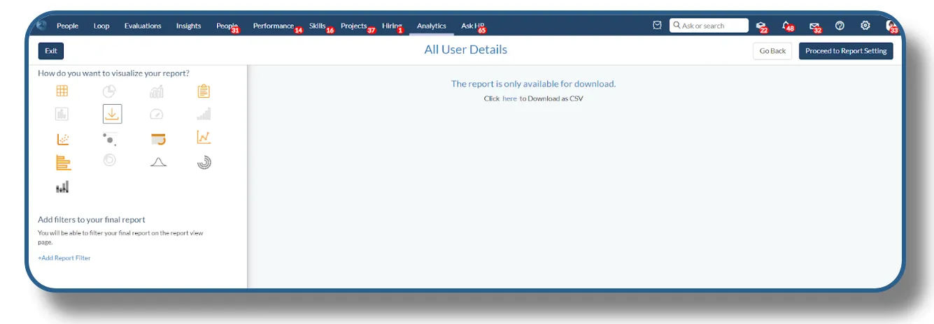
Downloadable Report
Users can create a report with download visualization. This is suitable for extensive reports and can have any number of columns.
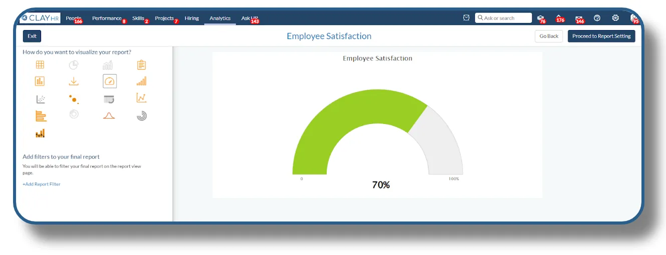
Dial Chart: Gauge Your Success
Dial Chart Visualization offers an intuitive and engaging way to track progress toward goals or thresholds. With its familiar gauge-like appearance, this chart is ideal for displaying performance metrics, making it easy to see at a glance whether you're on track. It helps visualize how your data measures up against predefined thresholds or limits, perfect for ensuring compliance, quality control, or operational efficiency. HR managers can use this gauge to quickly track the overall employee engagement score
The user needs to choose 2 string columns to create a gauge chart.
Drill Chart: Deep Dive into Details
Drill Chart Visualization empowers you to explore your data at multiple levels, offering a dynamic way to drill down into specifics. With this chart, you can start with a high-level overview and dig deeper into individual segments or categories for a comprehensive understanding. It is useful to understand the underlying causes of trends or anomalies by breaking down data into finer segments, helping to pinpoint areas for improvement or further investigation.
Department heads can track the progress of various goals at a high level and drill down into specific milestones or sub-goals to monitor detailed progress.
The user needs to add two string columns to create a drill chart.
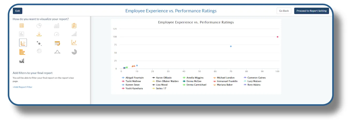
Scatter Chart: Uncover Patterns and Relationships
Scatter Chart Visualization is your tool for visualizing relationships between two numerical variables. By plotting data points on a grid, this chart helps you identify correlations, trends, and outliers, providing a clear view of how variables interact. It helps Identify anomalies or outliers in your data that may indicate issues or opportunities, helping you address potential problems or capitalize on unique insights such as the impact of marketing spend on sales or the correlation between customer satisfaction and retention rates.
HR professionals can use this chart to identify if employees with more experience are indeed performing better, or if there are outliers that need to be addressed
The user must select one string and two integer columns to create the scatter chart.
Bubble Chart: Multidimensional Insights
Bubble Chart Visualization offers a dynamic way to explore data with three dimensions: X and Y axes for positioning, and bubble size for magnitude. This chart allows you to visualize complex relationships and trends in a single, interactive view. It helps you to evaluate the impact of various factors by assessing both the position and size of bubbles, which can represent metrics like revenue, customer satisfaction, or operational performance.
As an example, bubble chart can be useful for analyzing whether employee salaries are in line with their experience and performance ratings.
To create the bubble chart, the user needs to add two string columns.
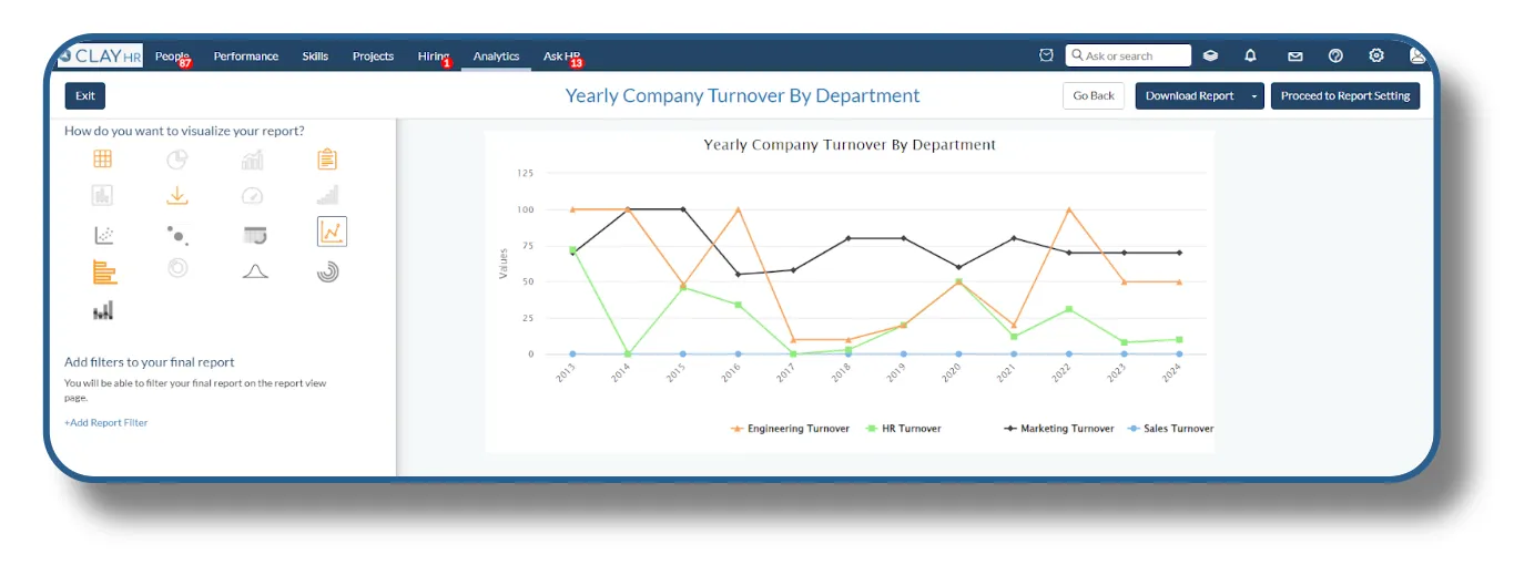
Line Chart: Track Trends Over Time
Line Chart Visualization is ideal for displaying data trends over time, providing a clear view of how values change. By connecting data points with a continuous line, this chart helps you track performance, identify patterns, and forecast future trends. It helps monitor and analyze changes over time, such as sales growth, stock market performance, or website traffic, to understand how metrics evolve.
The line chart can help stakeholders identify company’s yearly turnover by each department.
To create a line chart user needs to add one string column and the rest (n number) can be integer columns.
Stacked Bar Chart: Layered Comparisons
Stacked Bar Chart Visualization provides a powerful way to compare and analyze the composition of data across different categories. By stacking bars to show the contribution of each segment, this chart offers a detailed view of both individual and cumulative values. It allows you to visualize how different segments contribute to the total value within each category, ideal for understanding the distribution of sales, expenses, or other metrics across various groups.
The chart can help company management assess company turnover across departments.
The user needs to add one string and rest (n number) integer columns to create the stacked bar.

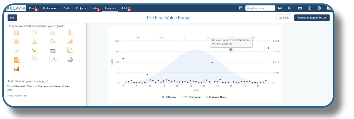
Bell Curve Chart: Understand Data Distribution
Bell Curve Chart Visualization is your tool for understanding the distribution of data across a normal range. This chart, shaped like a bell, helps you visualize the probability distribution of a dataset, making it easy to see where data points cluster and how they spread. It allows you to analyze the spread of your data in relation to the mean, allowing you to quickly identify how much variation exists within your dataset. The bell curve helps HR assess how employee performance is distributed across the organization, providing a clear view of how many employees are meeting, exceeding, or falling short of expectations. To create the bell curve chart, you need to have two columns, first one should be numeric and second one should be text. Also, you need to make sure both columns have non-empty values.
Candlestick Chart: Track Employee Turnover Trends
The Candlestick Chart Visualization is perfect for HR professionals seeking to analyze trends in employee turnover, absenteeism, or other key workforce metrics. By providing a detailed view of changes over time, this chart helps you understand fluctuations in your HR data. HRs can analyze turnover trends to identify patterns, such as higher turnover during specific months, or after organizational changes, to mitigate future risks. To create the Candlestick Chart, you need to have two columns, the first one should be text and second one should be numeric.
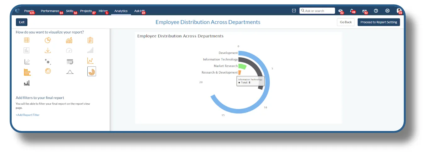
Radial Chart: Dynamic Data Exploration
Radial Chart visualization allows you to display complex relationships between various employee metrics, such as performance, engagement, and skill levels, all within a single, circular graphic. Easily spot outliers, compare categories, and track progress over time with a clear, at-a-glance overview.
HRs can use the radial chart to evaluate employees’ strengths and weaknesses across different competencies, allowing them to create personalized development plans.
To create the radial chart, users need to have one column in the report.
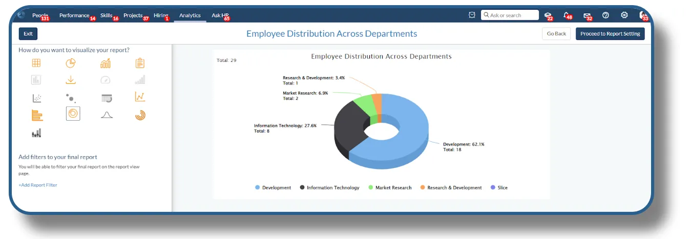
Donut Chart: Simplify Data Analysis
Donut Chart visualization is perfect for displaying categorical data with clear, immediate impact, Donut Charts provide a visually engaging way to break down key workforce metrics, such as employee distribution across departments, diversity ratios, or training completion rates.
The donut chart helps HR teams visualize the distribution of employees across departments, providing insights into workforce composition and resource allocation.
To create the donut chart, users need to have one column in the report.
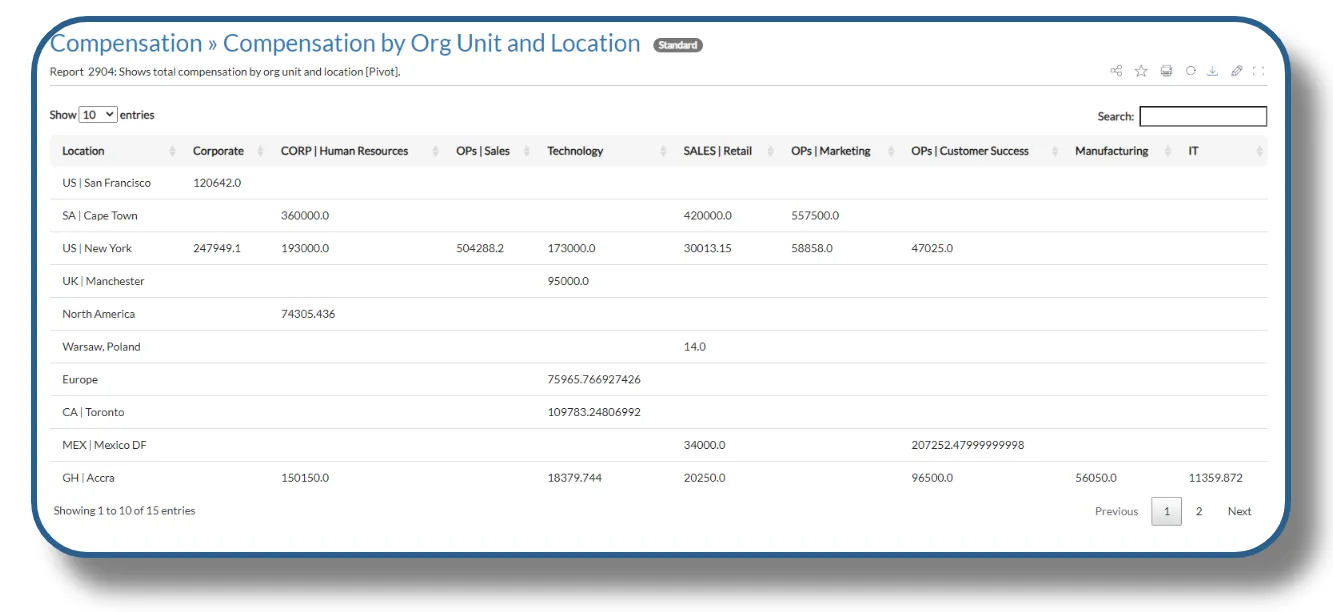
Pivot Table: Dynamic Data Exploration
Pivot Chart Visualization offers a versatile way to analyze and summarize your data dynamically. By allowing you to rearrange and filter data interactively, this chart helps you uncover insights and patterns that might not be immediately apparent. It allows you to engage with your data through interactive filters and pivot options like aggregating data from multiple dimensions, providing a comprehensive overview of metrics such as total revenue, average sales, or customer engagement.
By summarizing the average salary in each department, the pivot table can help with budget planning and compensation allocation.
To create the pivot table, users need to have three columns from which two should be a string and one needs to be an integer.
You can access the video tutorial illustrating the process of creating a “Pivot Table Report” through the following link: