

Report visualization is the process of representing data and information in a pictorial or graphical format that allows everyone to quickly grasp the significance of the content. So, that action can be taken quickly, and time is spent on decision-making rather than understanding data. The human brain processes information significantly more quickly when it is presented in graphical form.
Report visualization has emerged as a crucial component to present an intuitive view of data and makes it easier to spot trends, patterns, and correlations when represented graphically as compared to tables of data.
The visualization of information or data has always been important when examining related data. Additionally, processing visual information is significantly quicker and simpler than text. It tends to paint a true and accurate picture that aids in comprehending the scope of analysis.
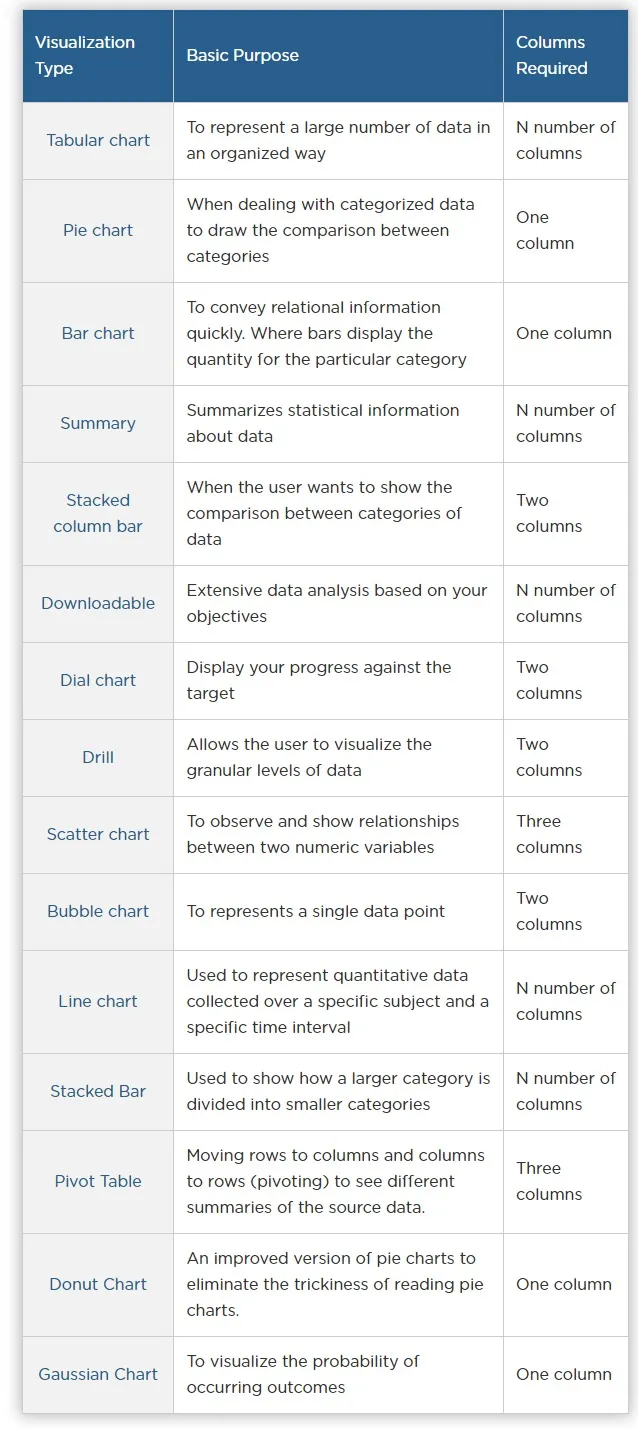
ClayHR comes up with a variety of visualizations in Reports. Whether you want to visualize a large number of data in a Tabular chart or draw a comparison between categories through a Pie chart or represent a single data point through a Bubble chart, ClayHR’s Auto-generated Report Generation System enables you to have different visualizations of your high-volume data explicitly.